Franciacorta proudly announces it is totally revamping itself with a new brand positioning and a revolutionary visual identity. This transformation marks a significant moment in Franciacorta history, guided by the AUGE branding and design studio.
The revamped visual identity distinguishes itself for modernity and elegance, reflecting Franciacorta’s historical heritage and projecting its vision toward the future. The new graphic elements capture the region’s essence resulting in a distinctive aesthetic appeal that will be recognised the world over.
The project’s aim is to take the Franciacorta essence from consortium to true brand status. A strong, recognisable and proud brand, able to express and represent itself with elements that mirror its prestige. For this reason, all the preliminary work focused on a profound understanding of what truly distinguishes Franciacorta. This analysis phase was conducted simultaneously on two different fronts: the first, conducted through consumer research to understand how people currently perceive the Franciacorta brand and its identity assets. The second served to study the aspirations, uniqueness and attitudinal aspects shared by the Consortium members.
It is specifically the Franciacorta method that becomes the key element of the new brand narrative, a method which, in this new vision, takes on dual meaning: it is in fact both the way each bottle of Franciacorta is produced and a lifestyle. An attitude consisting of courageous decisions, an extreme pursuit of quality and a desire to continually push beyond its limits. This new narrative aims to ennoble the process and nurture the value of the attention and meticulous care which Franciacorta strives to put into each step leading to the realisation of its product and promoting the region’s value. A brand that conveys the importance of the art of making and which bases its every action on the founding principles of rigour, discipline and selectivity. In this way, it proudly presents itself to successfully address a knowledgeable, passionate, aware and increasingly international audience.
The new positioning is actualised in two key elements: the brand essence “Excellence in the making”, which accentuates Franciacorta’s propensity for innovation and evolution, stressing the value of its production method and the new visual identity. Developing Franciacorta’s new visual identity plays a twofold role: the first is to enable the brand to communicate in an effective, consistent, recognisable and contemporary way on all touchpoints, from traditional and new media to digital channels, which are increasingly central to communicating wine; the second is to convey the winegrowers’ commitment and passion for sustainability and respect for the land.
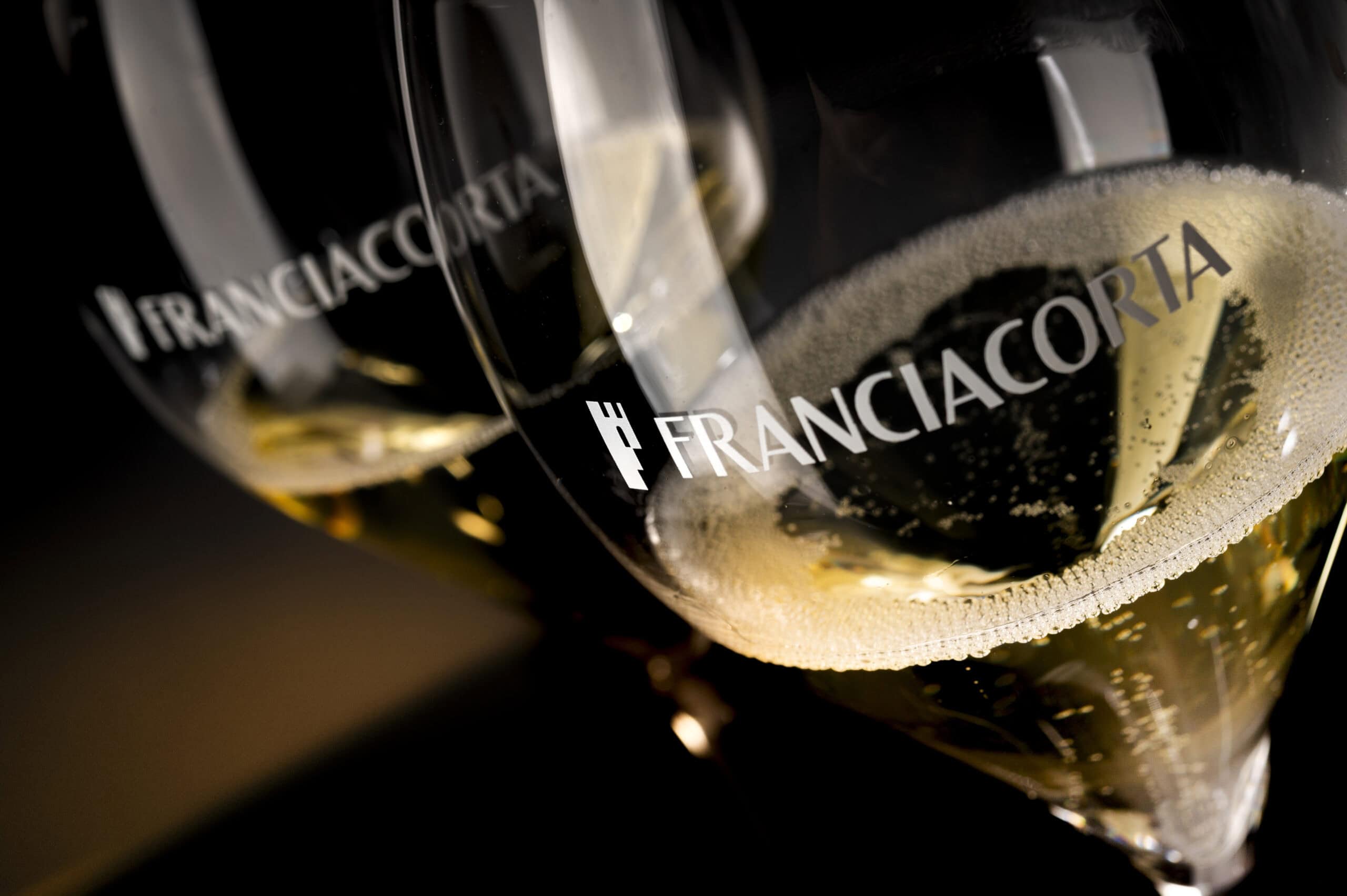
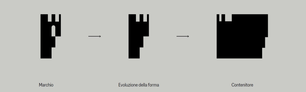
The “crenellated F” element, Franciacorta’s historical icon ever present in its visual identity, has been revamped in this new vision, acquiring greater solidity and a more harmonious form.
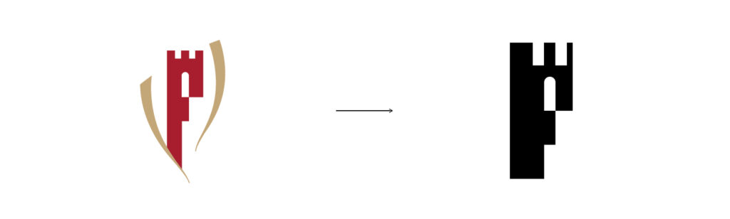
What is more, the “crenellated F” itself becomes the fulcrum and focal point of a dynamic and innovative design system, where the brand icon evolves and becomes a sort of window which opens out onto the world of Franciacorta, its region, wines and method.
A new colour palette and lettering created ad-hoc for the brand have been added to all these operations, aimed at increasing the brand’s iconicity by showcasing the “crenellated F“ so as to increase awareness and recognisability in order to convey the values, essence and true meaning of Franciacorta. The latter is directly inspired by the world of wine, communicating prestige and value through material tones that resonate with the typical colours of Franciacorta, from the wine’s characteristic golden colour to the warm brown that echoes the tones of the terroir. The new lettering, called Franciacorta Display, is custom-made for the exclusive use of Franciacorta and will be one of the key elements of the new identity. A simple font with a modern display, elegant contrasts and sleek proportions. A refined and eye-catching lettering able to convey the greatness of the Franciacorta brand, and which will become an integral part of the new visual identity the brand will use to communicate. Franciacorta display is also used in the updated Franciacorta and Strada del Franciacorta logos with entirely capitalised characters. This serves not only to achieve more harmonious and balanced proportions in the logos themselves, but to convey the pride and prestige the two brands symbolise.
Known for its high-quality work in branding and design, AUGE worked closely with the Franciacorta Consortium to bring this transformation into being. Their experience and creativity allowed them to create a visual identity that fully reflects Franciacorta’s unique essence.
A revamped Franciacorta represents an exciting new chapter in its history and confirms its commitment to excellence, innovation and the ongoing pursuit of perfection.